Hey everyone! I’m super excited to introduce ng-country-select – a high-performance, multilingual country autocomplete built on Angular and Angular Material. If you’ve ever needed a quick and elegant way to select countries in your apps (complete with flags, codes, and translations), look no further!
https://github.com/wlucha/ng-country-select
✨ Why ng-country-select?
- 🚀 Angular 16+ Ready – Fully compatible with Angular 16, 17, 18, and 19.
- 🌐 Multi-Language Magic – English, German, French, Spanish and Italian out of the box, and super easy to add more.
- 🎌 Automatic Flag Emojis – Zero image dependencies! Relying on ISO codes for the magic.
- 🔍 Intelligent Search – Match by local name, English name, alpha2/3 codes, or any available translation.
- 🎨 Material Design – Seamless integration with Angular Material for a polished UI.
- ⚡ Performance – RxJS-based searching with debouncing and optional virtual scrolling.
- 🧩 Standalone – Import the component directly, no extra boilerplate needed.
📺 Live Demo
Try it out in our Live Demo and see it in action!
🌍 Angular Compatibility
| Angular Version | Supported? |
|—-|—-|
| 
| 
| 
| 
🛠️ Setup in 60 Seconds
1. Install Dependencies
npm install --save @angular/material @angular/cdk @angular/animations @wlucha/ng-country-select
2. Import Component
import { CountrySelectComponent } from '@wlucha/ng-country-select';

@NgModule({
  imports: [
    CountrySelectComponent,
    // ... other imports
  ]
})
3. Add Basic Usage
<ng-country-select
  [lang]="'en'"
  (countrySelected)="handleSelection($event)"
></ng-country-select>
🎛️ Parameters
🎚️ Inputs
| Parameter | Type | Default | Description |
|—-|—-|—-|—-|
| defaultCountry | `Country | null` | null |
| selectedCountry | `Country | null` | – |
| lang | string | 'en' | Language for displaying country names (e.g., en, de, fr) |
| searchAllLanguages | boolean | false | If true, searching will match in all available translations |
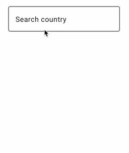
| placeholder | string | 'Search country' | Placeholder text for the input field |
| debounceTime | number | 100 | Debounce time in milliseconds for the search input |
| disabled | boolean | false | Disables the component if true |
| appearance | `’fill’ | ‘outline’` | 'fill' |
| required | boolean | false | Marks the field as required if true |
| showCodes | boolean | false | If true, shows alpha2/alpha3 codes in the autocomplete results |
| color | ThemePalette | 'primary' | Angular Material color palette to use ('primary', 'accent', 'warn') |
🚨 Outputs
| Event | Output | Description |
|—-|—-|—-|
| countrySelected | Country | Full country object on selection |
| inputChanged | string | Live search term updates |
| closed | void | When dropdown closes |
💻 Power User Setup
<ng-country-select
  [lang]="'en'"
  [searchAllLanguages]="true"
  [showCodes]="true"
  [debounceTime]="200"
  [appearance]="'outline'"
  [placeholder]="'Search country'"
  (countrySelected)="onCountrySelect($event)"
  (inputChanged)="trackSearchTerm($event)"
></ng-country-select>
🌟 Support the Project
Love this component? Here’s how you can help:
- ⭐ Star the repo (you’re awesome!)
- 🐛 Report bugs here
- 💡 Suggest features
- 📢 Share with your network
# Your star fuels development! ⭐
# Clone and explore:
git clone https://github.com/wlucha/ng-country-select.git