I’m Valeria Terekhina, a former Product Designer at Yandex, a technology company that develops products and services including search, maps, navigation, and mobility. I spent nearly four years working on Yandex Drive, the company’s free-floating car-sharing service.
For readers unfamiliar with the concept, it works differently from traditional car rental: users find an available car parked nearby, unlock it through the app, drive it for as little as a few minutes, and leave it anywhere within the service area when they’re done.
One of the most challenging features I worked on was Driving Profile—a system that transformed complex telematics data into a simple, visual experience that encouraged safer driving. The algorithm evaluated each driver’s most recent 200 km (or however much they had driven so far), taking into account hard braking, rapid acceleration, sharp turns, abrupt lane changes, and speeding.

Why We Needed a Driving Profile
-
Rising Insurance Costs: When users drive recklessly, they create more dangerous situations on the road. That increases insurance costs and, ultimately, rental prices for everyone. We wanted those higher costs to affect only the drivers responsible for them—not everyone else.
-
Public Perception: Reckless driving also hurt the public perception of car sharing. Complaints about dangerous driving made it seem like all Drive users behaved irresponsibly, even though the vast majority drove safely.
-
A More Transparent Algorithm: Our driving behavior model had matured significantly over time. It had become accurate enough that we felt confident exposing part of it to users, making the system more transparent instead of keeping it as a black box.
-
An Opaque Ban System: Before Driving Profile, we already analyzed driving behavior behind the scenes. Drivers could receive restrictions or temporary bans for reckless driving, but they had no visibility into why it happened or how close they were to being penalized.
-
The system escalated gradually: first, access to certain vehicle categories was restricted, then temporary bans were applied, and eventually permanent bans for repeat offenders. The only feedback users received was a series of warning screens:

In the end, we launched the second version of Driving Profile that I designed. Here’s how we got there.
The Outcome (If You Don’t Want to Read the Whole Story)
Shortly after the first version launched, users began driving 33% more safely, resulting in fewer harsh maneuvers. Even drivers who already had good driving habits improved further. Today, around 90% of Drive users drive safely, and that number continues to grow.

How It All Began
At the beginning, there was no clear definition of how the driving behavior algorithm should work. To move the project forward, I started sketching ideas and using them to drive discussions with the team.
Every conversation brought new insights, constraints, and edge cases. I’d revise the design, come back with a new iteration, gather more feedback, and repeat the process. By the end, we’d gone through dozens of iterations before arriving at the final experience.

Iteration #1: When Everything Seemed Simple
The first concept appeared in March 2021. At that point, the idea felt straightforward:
- Analyze the user’s last N trips.
- Classify each trip as either aggressive or non-aggressive.
- Highlight aggressive trips in the trip history and explain what caused them.
- Warn users when aggressive trips started to dominate their history.
- For example, if 3 out of the last 5 trips were classified as aggressive, we’d notify the driver that they were approaching the threshold for being considered an aggressive driver.

At the center of the interface was a progress indicator showing how many aggressive trips the driver had accumulated. To make the status instantly understandable, I used color coding: green for safe driving, orange as a warning, and red when the driver had exceeded the threshold and was considered an aggressive driver.
I also expected users to have questions about how the system worked, so I added a section at the bottom answering the most common ones.
Once we reviewed the concept, several problems became obvious:
- What happens after 120 days? At the time, the app only displayed trips from the previous 120 days (today it shows the full history). Could someone make several aggressive trips, stop driving for four months, and effectively reset their profile?
- What if the profile doesn’t reset? If we stored aggressive trips indefinitely, drivers would no longer be able to see which trips had affected their score because older trips disappeared from the visible history.
- What qualifies as a trip? Could someone rent a car ten times, drive just a few meters—or not drive at all—and improve their profile?
It quickly became clear that counting trips wasn’t the right metric. We needed to evaluate distance driven instead.
Iteration #2: Understanding How the Algorithm Works
Before moving any further, I needed to understand how the algorithm actually worked. That meant sitting down with Kirill Lunev, the data analyst who developed it.
Every Yandex Drive vehicle is equipped with telematics that collect data from multiple sensors several times per second. Along with basic information like speed, mileage, and acceleration, the system records throttle and brake input, steering angle, handbrake usage, and the status of the doors, hood, and trunk. All of this data is sent to our servers, where it’s analyzed to evaluate driving behavior.
One thing surprised me right away: the algorithm doesn’t judge drivers based on a single mistake. Instead, it evaluates the last 200 km of driving (or however much the user has driven so far). Each trip receives an internal score, and those scores contribute to an overall driver rating. The more aggressive the driving, the higher the score.
Since the algorithm was brand new, we decided not to expose the numerical rating in the first version of the interface. We weren’t sure how users would interpret it, so we displayed only the driver’s status.
Spoiler: the numerical score eventually made its way into the product.
As I dug into the algorithm, I started sketching diagrams on paper to understand how everything fit together. One realization quickly stood out: this wasn’t a binary system. It was a continuous scale, and the interface needed to reflect that instead of hiding it.

The system had five possible states:
- All Good
- Higher Prices
- Limited Access to Certain Cars
- Temporary Ban
- Permanent Ban
Each state also had its own level of progress. For example, a driver could be at the beginning of All Good or much closer to Higher Prices. In other words, the system wasn’t binary—it reflected how close the driver was to moving into the next state.
Key Elements to Display:
- Current status
- Progress within this status (so price increases or status changes are not unexpected)
- Previous and next statuses
- A block with answers to popular questions

Each status came with tailored guidance, helping users understand what they should do to keep or improve their driving status.
Iteration 3: My Favorite Colorful Scale
The previous concept felt overly complex and visually uninspiring. Since the Driving Profile dealt with a sensitive topic, we wanted the experience to feel simple, approachable, and even a little motivating.
That’s when we came up with the idea that became the foundation of the final design.
Instead of treating the progress indicator as just another UI component, we made it the interface itself. The progress scale spanned the entire width of the screen, and as the driver’s status changed, the colored area expanded from top to bottom. This made progress feel tangible while giving each status its own distinctive visual identity.
At a glance, drivers could immediately understand where they stood, how close they were to the next status, and whether they were improving or getting closer to a penalty. The interface no longer just displayed information—it communicated it through color, proportion, and movement.
This was the moment when the Driving Profile finally started to feel like a real product rather than just another settings screen.

I presented this concept to the team and went through several rounds of discussion. Eventually, we realized it had a few fundamental problems:
- Bans weren’t linear. The first violation resulted in a 3-day ban, the next in 7 days, then 10 days, and finally a permanent ban. Since the penalty escalated each time, a user could never receive the same temporary ban twice.
- The current status wasn’t obvious. The interface showed progress, but it wasn’t immediately clear where the driver actually stood within the system.
- The overall model had become too complicated. At that point, we decided to remove the “Limited Access to Certain Cars” state entirely. Supporting different restrictions and transitions made the experience unnecessarily complex. We simplified the system to include only price increases and bans.

After reviewing all the feedback, I refined the design by giving the current status much more visual prominence.
Iteration 4: A Horizontal Scale Inside a Vertical One
In this iteration, I put much greater emphasis on the driver’s current status and made progress within that status easier to understand.
While the hierarchy improved, the overall concept still didn’t feel right. The layout resembled a checklist or a to-do list, which wasn’t the experience we wanted to create. More importantly, combining a horizontal progress bar with a vertical status flow felt visually inconsistent and made the interface harder to scan.
It became clear that the progress indicator and the status hierarchy needed to work as a single visual system—not compete with each other.

I decided to switch back to a vertical progress scale. Although it improved readability, the interface became cluttered with text and lost much of its visual simplicity.

Iteration 5: Phases of the Moon
To avoid overwhelming users with large amounts of text, we decided to focus the interface on what mattered most—their current status. Instead of explaining every possible state, we told users what was happening now, what they could do about it, and what would happen next.
As a result, the interface was reduced to a single, context-aware status:

To the left of the scale, we displayed the driver’s current status, while the next status appeared on the right, making it clear where their progress was leading. We kept just two pieces of supporting information: one explaining the current situation and another describing what could happen next. Any additional details were moved behind a “What does this mean?” button.
Around this time, we realized we had been focusing too much on penalties and bans. In reality, around 80% of our users already drove safely, so the interface should encourage them—not just warn bad drivers.
We softened the tone of the experience by introducing positive reinforcement. As a quick solution, we added emojis (with plans to replace them with custom illustrations later—but the emojis ultimately shipped) along with encouraging messages like “Keep it up” and “Well done” for drivers who were doing well.

We center-aligned the content and moved the status name to the bottom, creating a cleaner visual hierarchy while ensuring the layout worked consistently across all status names.

By this point, everyone felt confident in the solution. The design worked visually, the logic was clear, and the implementation was technically feasible. Since we also had a launch deadline tied to our insurance partner, we decided this would be the final iteration.
Together with Olesya, our copywriter, we polished the microcopy and added moon phases—a small detail that gave the interface a bit more personality.

This version moved into development. Before the public release, we rolled it out internally to Yandex employees to validate the experience.
After launch, we continued refining the concept. To reward consistently safe drivers, we introduced a new status—Super Star. Drivers who maintained excellent driving behavior received the new status along with increased cashback in Yandex Plus points.

However, this interface wasn’t designed for a reward-based status. There was no indication on the scale of where the Super Star threshold was or how close a driver was to earning additional cashback.
This highlighted an important principle: users need to understand why they receive a particular driving status. Transparency was essential. We wanted drivers to know which actions affected their rating, what they could improve, and how their behavior influenced the outcome.
To achieve this, we later introduced trip statistics, highlighted locations on the map where risky driving was detected, and displayed warnings when a driver’s behavior became too dangerous. By providing clear, actionable feedback, we made it much easier for users to understand what they had done wrong and, more importantly, how to improve.

Second Version
The first version of Driving Profile remained unchanged for the next six months. During that time, we closely observed how people used it, collected feedback, and identified opportunities for improvement. Once we had enough insights, we started working on the redesign.
There was one more reason, too: Roma, who led design and marketing at Yandex Drive, had never been a fan of the moon phases.

What Needed to be Done:
-
Reverse the Scale: The original scale filled up as a driver’s behavior became more aggressive. This was counterintuitive and could feel like we were rewarding bad behavior. We reversed the concept and turned it into a trust credit that gradually depletes as users drive recklessly.

- Make “Super Star” a Separate Status: Give it its own place in the progression to make the reward visible and understandable.
- Show All Possible Statuses: Display the entire progression so users can clearly see their current status, upcoming statuses, and the overall journey.
- Reduce Explanatory Text: Replace lengthy explanations with a simpler, more visual experience.
Iteration 6: The One That Could Have Ended It All
Of course, the first thing we wanted to do was unfold the circular scale into a straight line. This is what we came up with:

I broke the copy from previous iterations into smaller, more digestible sections and paired each one with an icon. Then Roman suggested making the progress bar larger and more prominent:

I genuinely believed this would be the final iteration. It checked every box we had set out to solve.
Iteration 7: Introducing the Numerical Value
The previous iteration was already very close to the final design. However, Kirill, our Head of Mobile Development, suggested adding a numerical score to make changes in driving behavior easier to understand.
He had a point. It’s much easier to compare 72 and 80 than to estimate subtle changes on a progress bar with no reference points. A numerical score gave users a clear way to track their progress over time while preserving the simplicity of the visual scale.

This sounded reasonable, so I started adding the number:

To support the numerical score, the interface now needed to communicate much more information:
- The driver’s current score
- The numerical boundaries for every status
- The driver’s current status
- An explanation of the current status
- The names and descriptions of all other statuses
While this version solved some of the problems we had identified, it introduced a new one: the interface became noticeably more complex. Instead of simplifying the Driving Profile, we had overloaded it with information.
Iteration 8: The Final One
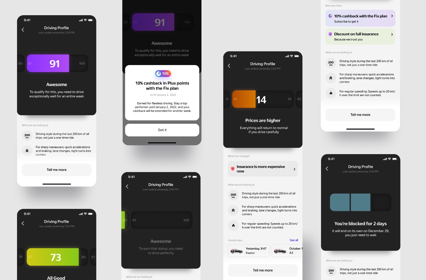
The solution was finally coming together. The numerical score replaced the status inside the progress bar, giving users a clear way to measure their progress. The current status became the centerpiece of the interface, with the previous and next statuses positioned on either side. Users could swipe horizontally to explore the full progression, while Super Star was promoted to its own status with a dedicated cashback reward.

I wanted the visualization to feel more immersive by adding depth and a subtle glow. Those effects worked beautifully on a dark background, so I decided to place the scale on a dark surface.

I especially like how the ban screens turned out:

Each status had two states: active and inactive. For each one, we created context-specific messaging—explaining how to maintain the current status, how to achieve it, or, in the case of negative statuses, how to avoid it:

The feature has evolved over time, but its core experience remains remarkably similar to what we designed. Even today, I consider Driving Profile one of my strongest case studies and one of the projects I’m most proud of.